Understanding Sign Lettering Styles: A Guide for Restoration
Restoring vintage record store signs isn't just about refreshing paint and fixing rust. It's about preserving a piece of history, a tangible connection to a vibrant era of music and culture. A critical component of authentic restoration is accurately replicating the lettering style. Many collectors and enthusiasts would agree that lettering is the key in bringing these beauties back to their former glory. This guide explores common lettering styles found on vintage record store signs, providing insights to help you identify and reproduce them with accuracy, ensuring your restoration is a tribute to the original artistry.
The Importance of Accurate Lettering
Original lettering often reflects the aesthetic trends and design sensibilities of the time. It's a visual fingerprint of the sign's history. Incorrect lettering—a modern font applied to a 1950s sign, for example—immediately detracts from the authenticity and value. Reproducing the lettering correctly doesn’t just look better; it demonstrates respect for the sign’s heritage and enhances its appeal to collectors and enthusiasts. Think of it as completing the puzzle - an original sign speaks volumes, but the lettering is the finishing piece.
Common Lettering Styles Found on Record Store Signs
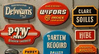
Let’s break down some of the most prevalent lettering styles you’re likely to encounter on vintage record store signs. We’re focusing on general characteristics, as variations were always common. Remember to always refer to the original sign as your ultimate reference.
1. Hand-Painted Block Letters
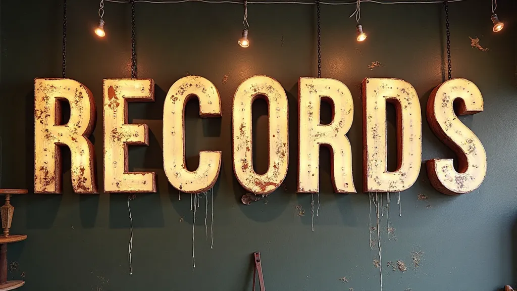
This is arguably the most common style. Early signs were almost exclusively hand-painted. These block letters, while seemingly simple, were often executed with a surprising level of skill. The beauty lies in the slight imperfections – the subtle variations in letter height, width, and stroke thickness. Reproducing this requires not just choosing a similar font (though that helps), but *simulating* the hand-painted look. This involves a slightly uneven application of paint, visible brush strokes, and a touch of "wobble." A good starting point is selecting a font like "Franklin Gothic" or similar, then manipulating it to have a more human touch.
2. Art Deco Lettering
Art Deco lettering, popular from the 1920s to the 1940s, is characterized by geometric shapes, streamlined forms, and a sense of elegance and modernity. These letters often have a distinctive "flared" or "tapered" appearance. Key features include sharp angles, clean lines, and often incorporate stylized decorative elements. Fonts like “Futura” or similar sans-serif fonts can provide a base, but you're aiming for a more stylized, almost architectural feel. Pay attention to the spacing—Art Deco lettering often features generous letter spacing, adding to the overall sense of luxury and refinement. You will want to emulate the streamlined, elegant aesthetic.
3. Script and Cursive Lettering
While less common than block letters, script and cursive lettering appears on some vintage record store signs, particularly those from the mid-century era. These styles convey a sense of personality and charm. Replicating script lettering is challenging, requiring a steady hand and a keen eye for detail. Start with a font that closely resembles the original, and practice the strokes until you can mimic the flow and rhythm of the lettering. It is often helpful to use guidelines to maintain consistency in letter height and slant.
4. Brush Script Lettering
Brush script lettering is a specialized form of script lettering created using brushes instead of pens. This creates a more fluid, dynamic appearance. Often used in signage during the 1950s and 1960s, you may see brush lettering used on storefront signs of various retailers. Brush script lettering often has thick downstrokes and thin upstrokes, creating a calligraphic effect. To replicate brush script lettering, use a brush with varying widths.
5. Neon-Inspired Lettering
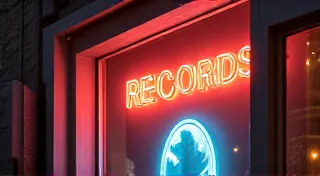
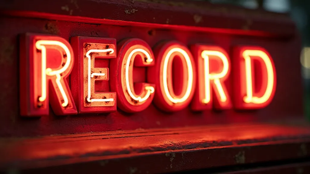
With the rise of neon signs, some record store signage incorporated lettering that mimicked the appearance of neon tubing. This style often features rounded edges, thick strokes, and a sense of illumination. It’s important to note that this is *mimicking* neon, not actually using neon (although some signs genuinely incorporated neon). Consider fonts with rounded terminals and a bold, impactful presence.
Tools and Techniques for Replication
Once you’re familiar with the common lettering styles, the next step is to learn how to replicate them. Here are a few tools and techniques to consider:
- Tracing: This is often the easiest starting point. Carefully trace the original lettering onto tracing paper, then transfer the tracing to your restoration surface.
- Freehand Painting: For more experienced restorers, freehand painting offers the most authentic result. Use high-quality acrylic paints and appropriate brushes.
- Stencils: Stencils can be useful for reproducing uniform lettering, but use them sparingly to avoid a mass-produced look. Consider creating your own custom stencils for a more unique touch.
- Computer-Generated Fonts: While a computer-generated font can provide a starting point, remember to customize it to match the unique characteristics of the original lettering. Adjust the spacing, thickness, and overall appearance to achieve a truly authentic reproduction.
Tips for Accurate Restoration
Beyond just replicating the lettering style, keep these tips in mind for a successful restoration:
- Photograph the Sign: Take detailed photographs of the sign from multiple angles before starting the restoration process. These photos will serve as a valuable reference throughout the project.
- Analyze the Original Materials: Try to identify the original paint colors, materials, and techniques used in the sign's construction. This will help you choose appropriate restoration materials.
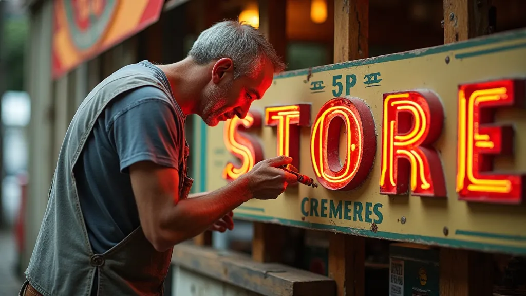
- Respect the Wear and Tear: While the goal is to restore the sign, remember to respect the signs of age and wear. These imperfections tell a story and add character. Don't try to eliminate every scratch or blemish.
- Practice, Practice, Practice: Restoring vintage record store signs is a skill that takes time and practice to develop. Don’t be afraid to experiment and learn from your mistakes.
Conclusion
Restoring vintage record store signs is a rewarding endeavor that combines artistry, historical knowledge, and a passion for music memorabilia. By understanding the common lettering styles and mastering the techniques for accurate replication, you can breathe new life into these iconic pieces of history, ensuring that their stories continue to be told for generations to come. Remember to always prioritize authenticity and respect the sign's unique character – that’s the key to a truly successful restoration.
