The History of Record Store Signage: A Nostalgic Look
For those of us who cherish the tactile experience of browsing vinyl, the scent of aged paper, and the thrill of the find, record stores hold a unique and powerful place. Beyond the music itself, the visual aesthetic – especially the signage – played a vital role in attracting customers and establishing a store's identity. These signs, often enduring through decades, are now themselves valuable pieces of music memorabilia, ripe for restoration. Let's take a nostalgic look back at the evolution of record store signage, exploring the techniques, materials, and styles that defined an era.
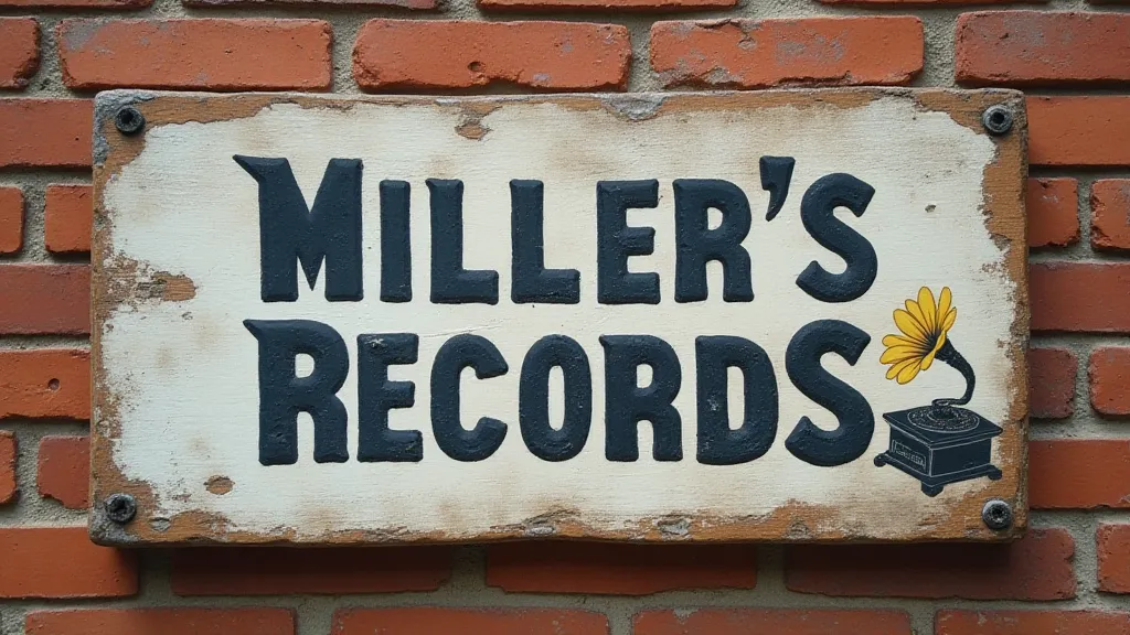
The Early Years: Hand-Painted Charm (1930s - 1950s)
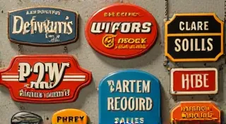
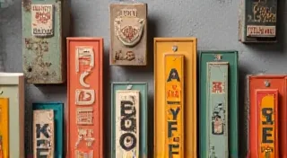
The golden age of the independent record store began in the 1930s, coinciding with the rise of 78 RPM records. Signage during this period was largely the domain of local sign painters. These artisans relied on hand-painted signs, often featuring bold lettering and simple, eye-catching designs. Fonts were typically sans-serif, mimicking the industrial aesthetic of the time, though flourishes and decorative elements were common, especially in more upscale neighborhoods. Materials were limited to wood, often cedar or pine, and metal—sheet aluminum was becoming increasingly popular. The paint itself was typically enamel-based, chosen for its durability and resistance to the elements.
These early signs often prominently displayed the store's name and perhaps a few key genres offered. Simplicity was key – remember, visual communication was limited by the technology of the time. The signs often reflected the local community and the store’s personality, becoming cherished landmarks.
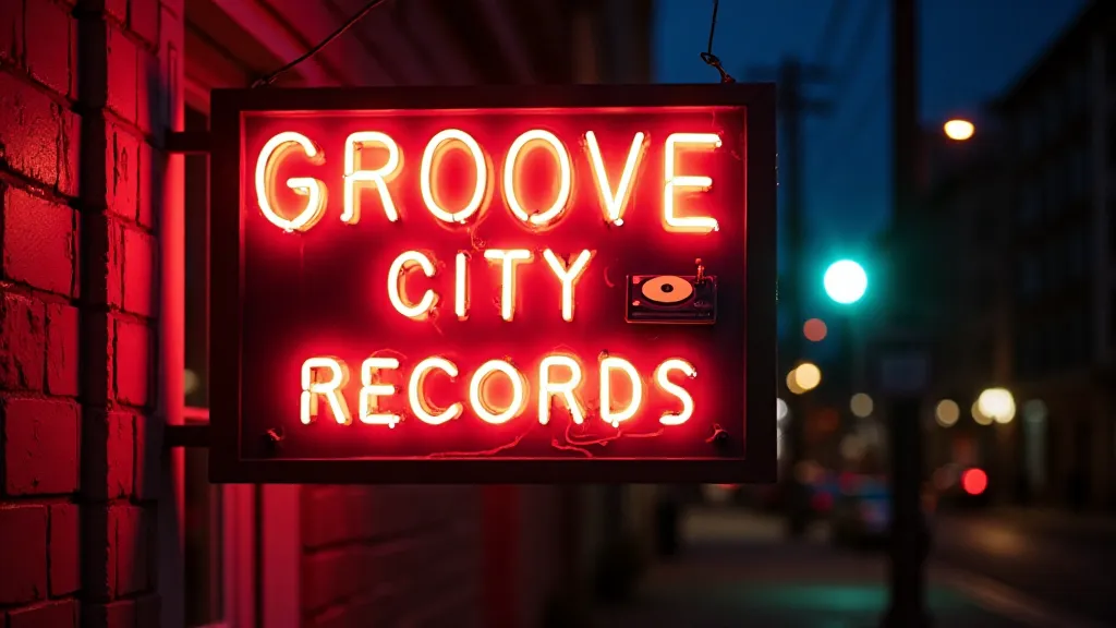
The Rise of Neon and Mid-Century Modern (1950s - 1970s)
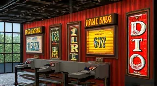
The post-war boom brought new technologies and design trends, and record store signage was no exception. Neon signs became increasingly common, adding a dazzling glow to storefronts and creating a sense of excitement. The vibrant colors and sleek lines of neon perfectly complemented the mid-century modern design aesthetic. This era saw the rise of iconic record store names like Tower Records and Sam Goody, and their signage reflected this new era of commercialism and design.
During this period, metal signs, particularly those made of aluminum, were also popular. These signs were often screen-printed with vibrant colors and modern fonts, reflecting the graphic design trends of the time. The move towards mass production meant signs could be produced more quickly and cheaply, allowing more stores to adopt the new styles. Some signs incorporated playful illustrations, often depicting musicians or album covers.
The Age of Albums and Bold Graphics (1970s - 1980s)
The 1970s and 1980s were a pivotal time for the record industry, witnessing the rise of vinyl LPs and the explosion of punk, disco, and new wave music. Record store signage reflected this vibrant cultural landscape. Signs often featured bold graphics, album cover art, and artist names. The use of fluorescent colors became prominent, further enhancing the visual impact of the storefront. Some stores experimented with three-dimensional signs, adding depth and complexity to their displays.
This era saw a broader experimentation with materials. Plastics, like acrylic and polycarbonate, began to be incorporated, offering greater design flexibility and durability. The rise of personal computers also began to influence sign design, although hand-painted elements were still very common.
The Digital Shift and Beyond (1990s – Present)
The rise of digital music and online retailers significantly impacted the record store landscape in the 1990s and beyond. While many independent stores struggled, some adapted, focusing on a curated selection of vinyl and creating a unique shopping experience. Signage during this period became more diverse, ranging from minimalist designs to retro-inspired recreations of classic signs.
LEDs became increasingly prevalent, offering energy efficiency and design flexibility. The use of digital printing allowed for highly detailed graphics and personalized messages. However, there was also a renewed appreciation for the craftsmanship of vintage signs, leading to a resurgence in hand-painted and neon signage for some stores.
Restoration Considerations: Preserving a Piece of Music History
For those of us dedicated to preserving these iconic pieces of music memorabilia, restoration presents unique challenges. Here are some key considerations:
- Material Identification: Determining the original materials (wood, aluminum, neon, paint type) is crucial for choosing appropriate restoration techniques.
- Paint Analysis: Understanding the original paint composition helps avoid damaging the sign during cleaning and repainting.
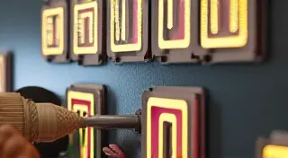
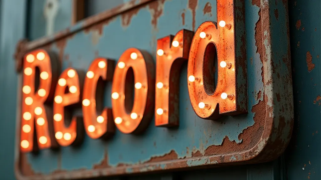
- Neon Repair: Restoring neon signs requires specialized knowledge and equipment. It’s best left to professionals.
- Preserving Patina: While cleaning is necessary, preserving the original patina – the aged appearance – can add character and authenticity.
- Documentation: Thoroughly documenting the restoration process ensures that future generations understand the sign’s history and the techniques used to preserve it.
Conclusion
Record store signage offers a fascinating window into the history of music and popular culture. From the simple charm of hand-painted signs to the dazzling glow of neon displays, these signs represent a bygone era of independent record stores and a passionate community of music lovers. By understanding the history of these signs and employing careful restoration techniques, we can ensure that these iconic pieces of music memorabilia continue to inspire and delight for generations to come.